Hans Haacke’s “News” (1969)

News, source

Some of my favorite art is that which exists at the blurred intersection of creativity and the sociopolitical. I’d argue that all art carries some sociopolitical commentary given that art is never produced in a vacuum. Artists are informed by their surroundings. What happens, what has happened, and what will happen influence the way all of us interpret the world. There is truly no neutral ground. Everything we read, hear, watch, and say are byproducts of our accumulating experiences. Every place we occupy whether for work, education, or pleasure is infused with mainstream ideologies.

And what’s particularly relevant here, the spaces we display art and the art shown exhibited represent what has been deemed important. As much as they may try to conceal it, museums are highly subjective–showing what they think deserves to be seen. Some argue that they have a duty to be political. What’s more, these spaces are at the will of funders who have amassed their wealth by taking advantage of this economic system we call capitalism.

German-born artist Hans Haacke was on of the first to formally announce this Institutional Critique, which relates to criticism of hierarchies of power in the arts sector. Haacke is a fascinating figure, never afraid to get himself into hot water. And we all know that being unabashedly and outspokenly political can hinder your career. Some museums, galleries, and other exhibitions spaces shy away from “controversial” artists who could be polarizing and turn off certain visitors, funders, etc..

News, re-exhibited in 2008 at SFMOMA

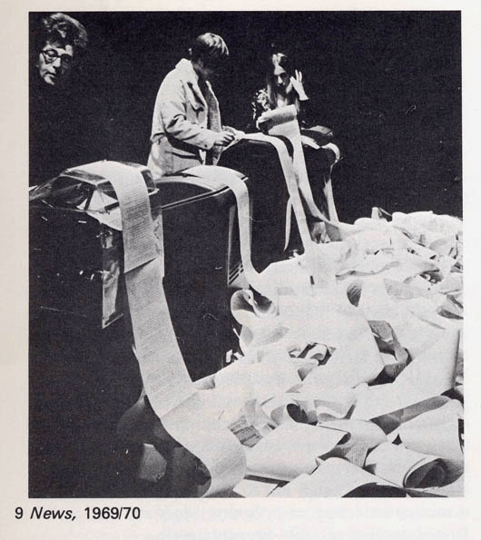
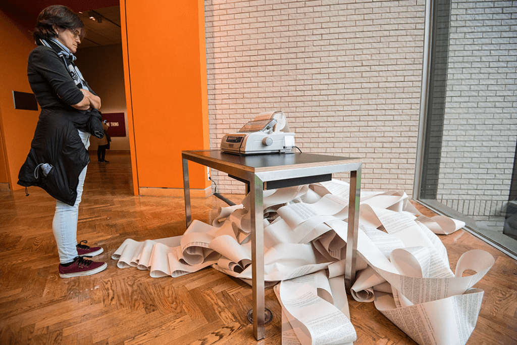
In his News, originally shown in Germany in 1969, Haacke brings what we sometimes consider to be the “outside world” into the gallery space. This thinking that the museum somehow exists “separate” from this “outside world” is harmful. News is an installation that includes a printer situated on a table. It was linked to the news wire of a news agency. The timing of this piece is important because it came less than a year after the 1968 assassination of MLK. I imagine Haacke must have felt uncomfortable with the idea of not addressing the violence and injustices. Not addressing them is synonymous with ignoring them, which is unacceptable.

As news stories go live, Haacke’s work would print them out in paragraph format. They kept coming. News never sleeps. The scroll of news spilled out onto the floor and as the exhibition went on, the serpentine paper grew longer. The long band of paper created a mound on the floor. Guests are free to read the stories, but the pile is overwhelming. It makes you think about how we’re inundated with so much news that it becomes impossible to take in. What do we choose to focus on? How do news outlets decide that for us?

News makes me think about how mainstream media can skew our views, pushing us to focus on particular topics. Abruptly ending coverage on a certain string of occurrences in favor of whatever’s “hot”. Haacke’s work reminds us that there’s so much happening at every moment–even when we’re perusing an artistic space. We can’t escape it. A lot of the time, it feels that we need to in order to keep sane. But the stories pile up, exemplified by the growing mountain of paper, tangled at our feet and waiting for us to take notice. The elephant in the room.

News is one of those pieces that is relevant across time. I’m thinking about it especially today as the crisis in Ukraine worsens. Things are terrifying and sometimes we feel helpless. However, there are things we can do to help including staying in the know, spreading awareness, making our voices heard, and donating.

Wong Ping’s “An Emo Nose” (2015)

Wong Ping, An Emo Nose, 2015

Surrealist animator Wong Ping knows a thing or two about absurdity. Actually, I think he encapsulates what it means to be absurd. He finds and shares the meaning in it. He manages to make it humorous and at times even facetious. He encourages us to laugh–and even feel a level of discomfort at the sometimes unsettling animation and subject matter, often dealing with sex, family, and relationships. But he also coaxes us to look inward at our own desires and anxieties.

Born in Hong Kong in 1984 and pursuing a bachelor’s degree in Perth, Ping tried his hand at journalism before starting the Wong Ping Animation Lab in 2014. His Instagram bio, in all of its contradictions, embodies his satirical ethos. After all, he considers himself a comedian:

A devout atheist. An optimistic pessimist. A slow living fast food waiter. A weekend vegetarian. Your silence neighbor.

Wong Ping on Instagram
Still from An Emo Nose

Every time I see his videos and installations in museums, I know I’m in for a treat. He’s one of the few artists who can absorb me into his videos for their entirety. They’re rarely longer than 10 minutes and even then, they go by quickly given the fascinating visuals and unique storytelling.

An Emo Nose is a piece I remember well, having watched it at the Wong Ping’s first American survey exhibition at the New Museum in 2021. A screen was set on the gallery floor, propped against the wall so that you had to look down at it. I’ve seen people sit on the cold slab of the floor to watch.

A recurring motif in An Emo Nose is a cluster of bees. I think this is Wong Ping nudging the idea of hive mind. That we rarely think truly for ourselves, but rather go along with the decisions of the majority. Like worker bees who have few purposes in life outside of feeding the queen, collecting pollen, and creating beeswax, we humans share a lot of the same goals, whether we like it or not. We seek out friendships, sex, and work. We struggle to fit in, but often try desperately to do so even though standing out is sometimes applauded. (If you do it right.)

Wong Ping, source

The human protagonist of An Emo Nose admits rather cynically to going through the motions of spending time with friends, if only to appease the teachers who recommended this to him. In aligning with that hive mentality, the protagonist goes along with what is generally accepted. His closest “friend” (very close, being that it is connected to his face) is his nose, shaped like an upside down heart which grows longer when exposed to negative energy. It makes you think about the things we do to keep those we care about close to us. And even those we don’t care about, but are fearful to lose and become alone. We fear distance even if we crave alone time.

The video ends on an optimistic note, depending on how you interpret it. The nose stretches so far, lives out its own independent life, and wraps all the way around the globe to return to the protagonist. Is their reunion for the best? Will the protagonist be able to quell his qualms with his nose? Or will his annoyances only bubble up again and lead to this cycle of separation and unity?

Something common to just about every Wong Ping video I’ve seen is that it is narrated by an omniscient third person–always off screen, always straightforward and blunt in their words. Or we are granted access into the main character’s internal monologue, as is the case in An Emo Nose.

Installation at the New Museum

I’ve always loved absurdity and paired with these neon, highlighter bright colors that Ping loves to use, his bizarre stories are captivating. Keep your eyes–or nose–out for the gloriously weird things Ping will make next.

Chitra Ganesh’s “Sultana’s Dream: City in Broad Daylight” (2018)

Chitra Ganesh is a contemporary artist from Brooklyn, born to Indian immigrant parents. Growing up in an Indian diaspora and having been exposed a lot of Bollywood imagery and Amar Chitra Katha comics, Ganesh incorporates these visual and cultural references into her art.

The Whitney Museum of American art collects a lot of her art, most notably the Sultana’s Dream series which includes 27 linocuts. The linocut printing process is a careful and laborious one, involving using something like a tiny scalpel to carve a relief into a block of linoleum. After carving, you use an ink-soaked roller to coat the linoleum and then press it onto paper. This allows for multiple prints. 35 editions of Ganesh’s Sultana’s Dream series exist.

Sultana’s Dream: Baby Queen via the Whitney

The series’ name, Sultana’s Dream, pays homage to Rokeya Sakhhawat Hossain’s 1905 feminist utopian text. The Benghali author and social reformer was born into a Muslim family, which may explain why she titled her work with Sultan, the tile for the king of a Muslim state. I think that to “feminize” the title, she converted it to “Sultana”.

Ganesh cites drawing inspiration from a ton of different sources like “buried narratives” and “marginal figures” often at the outskirts of the traditional literary, art, and historical cannon. There’s so much more that influences her from imperialism to European fairy tales and even to anime. Knowing this fosters a deeper appreciation for her works because you can truly see all of these things.

City in Broad Daylight reminds me of the Limbourg Brothers’ Book of Hours (seen below). I find that Ganesh’s work echoes the steep perspective which shows off the architecture in the background with figures in the foreground.

Limbourg Brothers, Book of Hours tiles (15th century). source

City in Broad Daylight is futuristic and a bit whimsical. We see a young figure on the left with a headpiece resembling the Statue of Liberty, someone with a lantern for a head, an absurdly long-necked person in the back, and a young woman who looks like a superhero with a gear on her chest. These are just a few of the curiosities in the linocut. The Islamic arches juxtaposed with the many different types of foliage and futuristic buildings make for lack of a better word, disarray. But it works within the context of a utopia wherein anyone is free to be who they want and navigate their diverse surroundings comfortably.

I’m particularly drawn to the two figures in the bottom right. The rightmost looks directly at you. The confrontation between viewer and the depicted is not really threatening. It’s more of a recognition and I read their expression as a rather kind acknowledgment. The (I assume) woman next to them is seen in three-fourths view. She stares outward confidently. I don’t know for sure, but the markings on her face could be a sign of her age or could be decoration.

The sepia tones of the print remind me of old-time photographs. A revised history. An imagined society. A “what could have been”? After all, it is a dream.

Chitra Ganesh, source

I believe Ganesh’s works–especially her Sultana’s Dream— embody post-modernism in her myriad inspirations and willingness to dissect the systems and stories we’ve come to know. She has a critical eye, but doesn’t critique with anger. She critiques by imagining other ways of being, documenting her own visual language. In looking to the past and how it endures, she crafts an extraordinary future. I look forward to what she creates next.